导读
子组件是在 Vue 组件中被引用的组件,它可以接受来自父组件的 props 数据,并根据这些数据进行渲染。子组件可以被多个父组件引用,提高了组件的复用性。在 Vue 3 中,我们可以使用 defineProps 定义组件的 props,以及 defineEmits 定义组件的自定义事件,使得组件的使用更加明确和类型安全。另外,Vue 3 推荐使用 Composition API 编写组件逻辑,使用 setup() 函数来定义子组件的逻辑代码,让组件更加易于维护和扩展。
其实一路学习下来或多或少都有了解了,这里只是给一些综合案例代码再次感受下组合式API的魅力罢了~
例1:在 Vue 中定义和使用子组件 定义子组件 Child1
<template>
<div class="container">
<div class="card">
<div>
<p class="name">{{name}}</p>
<p class="location">{{country}}</p>
</div>
<img :src="avatar || '/src/assets/vue.svg'"/>
</div>
</div>
</template>
<script setup lang="ts">
// 定义属性, 编译宏
defineProps<{name:string,country:string,avatar?:string}>()
</script>
<style scoped>
.container {
width: 100%;
display: flex;
flex-wrap: wrap;
justify-content: space-evenly;
flex-direction: row-reverse;
}
.name {
font-weight: bold;
}
.location {
font-size: 0.8em;
color: #6d597a;
}
.card {
display: flex;
justify-content: space-evenly;
padding: 1em;
margin: 1rem;
border-radius: 5px;
background: #fff;
width: 200px;
box-shadow: 0 14px 28px rgba(0, 0, 0, 0.25), 0 10px 10px rgba(0, 0, 0, 0.22);
}
.card:hover {
transform: rotate(-5deg);
}
.card img {
margin-left: 1em;
border-radius: 50%;
max-width: 55px;
max-height: 55px;
}
</style>
父组件引用
<template>
<Child1 name="张三" country="中国" avatar="/src/assets/vue.svg"></Child1>
<Child1 name="李四" country="印度" avatar="/vite.svg"></Child1>
<Child1 name="王五" country="韩国" ></Child1>
</template>
<script lang="ts" setup>
import Child1 from '../components/Child1.vue';
</script>
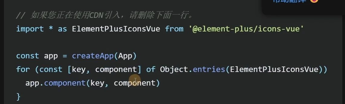
除此之外,我们还可以使用app.component(key,component)在根组件中实现全局注册,那么就不需要再每个组件中都单独引入。
同样的我们还可以将大量的组件封装成数组然后遍历实现批量注册,以Element-UI组件库为例:
例2:使用 RandomUser API 获取数据并在 Vue 子组件中使用
首先添加类型说明 model/ModelRandomUser.ts
import { AxiosResponse } from "axios";
export interface AxiosRespResults extends AxiosResponse<Results>{}
export interface Results {
info: {
page: number,
results: number
},
results: Result[]
}
export interface Result {
gender: 'male' | 'female',
name: {
first: string,
last: string
},
location: {
country: string
},
picture: {
medium: string
},
login: {
username: string
}
}
子组件不变,父组件使用子组件
<!-- 父组件 -->
<template>
<Child1 v-for="u of users"
:name="u.name.first"
:country="u.location.country"
:avatar="u.picture.medium"
:key="u.login.username"></Child1>
</template>
<script setup lang="ts">
import axios from "axios";
import { useRequest } from "vue-request";
import { computed } from "vue";
import { AxiosRespResults } from '../model/ModelRandomUser'
import Child1 from "../components/Child1.vue";
const { data } = useRequest<AxiosRespResults>(
()=>axios.get('https://randomuser.me/api/?results=3')
)
const users = computed(()=>{
return data.value?.data.results || []
})
</script>
如果觉得 Result 数据结构嵌套太复杂,还可以做一个类型映射
<!-- 父组件 -->
<template>
<Child1 v-for="u of users"
:name="u.name"
:country="u.country"
:avatar="u.avatar"
:key="u.username"></Child1>
</template>
<script setup lang="ts">
import axios from "axios";
import { useRequest } from "vue-request";
import { computed } from "vue";
import { AxiosRespResults, Result } from '../model/ModelRandomUser'
import Child1 from "../components/Child1.vue";
const { data } = useRequest<AxiosRespResults>(
()=>axios.get('https://randomuser.me/api/?results=3')
)
const users = computed(()=>{
return data.value?.data.results.map(resultToUser) || []
})
interface User {
name: string,
country: string,
avatar: string,
username: string
}
function resultToUser(r:Result):User {
return {
name: r.name.first,
country: r.location.country,
avatar: r.picture.medium,
username: r.login.username
}
}
</script>
- resultToUser 将 Result 类型映射为 User 类型
例3:动态组件响应属性:is
在一个页面中可能有多个Tab进行来回切换(组件切换),我们会怎么做呢?可能是路由、可能是多个if、else标签
但是我们可以使用动态组件实现这种切换
在使用动态组件的场景下,并不需要使用v-if、v-show等指令来控制子组件的显示和隐藏,而是通过动态组件的特性来实现。下面是一个更加准确和清晰的示例代码:
父组件:
<template>
<div>
<button @click="toggleComponent">Toggle Component</button>
<component :is="currentComponent"></component>
</div>
</template>
<script>
import { defineComponent, ref } from 'vue'
import ComponentA from './ComponentA.vue'
import ComponentB from './ComponentB.vue'
export default defineComponent({
components: {
ComponentA,
ComponentB
},
setup() {
const currentComponent = ref(ComponentA)
const toggleComponent = () => {
currentComponent.value = currentComponent.value === ComponentA ? ComponentB : ComponentA
}
return {
currentComponent,
toggleComponent
}
}
})
</script>
子组件A:
<template>
<div>Component A</div>
</template>
子组件B:
<template>
<div>Component B</div>
</template>
在上面的例子中,我们使用了动态组件的特性来实现子组件的动态切换,而不需要使用v-if、v-show等指令来控制子组件的显示和隐藏。在父组件中,我们使用<component>元素来渲染动态组件,并使用:is属性绑定一个响应式变量currentComponent,该变量的值会根据用户的操作动态改变。在toggleComponent方法中,我们只需要修改currentComponent的值,然后动态组件会自动切换并重新渲染子组件。
例4:异步组件defineAsyncComponent
当我们的应用变得越来越大时,加载所有组件的初始渲染时间会变得越来越长,这会影响用户的体验。异步组件可以帮助我们按需加载组件,从而提高应用的性能和效率。比如:常见的骨架屏(加载成功前的白屏效果~)
以下是一个更具体的案例,我们假设有一个ProductList组件,它会渲染一个产品列表。在这个列表中,每个产品都有一张图片,但是这些图片可能会很大,导致初始渲染时间很长。为了解决这个问题,我们可以将每个产品的图片作为一个异步组件来加载。
首先,我们需要定义一个异步组件来加载图片:
import { defineAsyncComponent } from 'vue'
const AsyncImage = defineAsyncComponent(() => {
return import('./AsyncImage.vue')
})
在AsyncImage.vue组件中,我们可以按照需要加载图片:
<template>
<img :src="src" />
</template>
<script>
export default {
props: {
src: String
}
}
</script>
现在,我们可以将ProductList组件修改为:
<template>
<div>
<h1>Product List</h1>
<ul>
<li v-for="product in products" :key="product.id">
<h2>{{ product.name }}</h2>
<async-image :src="product.image" />
<p>{{ product.description }}</p>
</li>
</ul>
</div>
</template>
<script>
import { defineAsyncComponent } from 'vue'
const AsyncImage = defineAsyncComponent(() => {
return import('./AsyncImage.vue')
})
export default {
data() {
return {
products: [
{
id: 1,
name: 'Product 1',
image: '/images/product1.jpg',
description: 'Description of product 1'
},
{
id: 2,
name: 'Product 2',
image: '/images/product2.jpg',
description: 'Description of product 2'
},
{
id: 3,
name: 'Product 3',
image: '/images/product3.jpg',
description: 'Description of product 3'
}
]
}
},
components: {
AsyncImage
}
}
</script>
在上面的代码中,我们使用了AsyncImage组件来渲染产品图片,这个组件会异步加载图片文件。这样,当我们渲染ProductList组件时,只会先加载文本内容,而图片则会在需要时异步加载,从而提高了初始渲染的速度和性能。
总的来说,异步组件可以帮助我们实现按需加载组件,从而提高应用的性能和效率。在需要加载大量图片或其他资源时,使用异步组件可以让我们更好地控制资源的加载和使用。
例5:传送组件Teleport
说实话这个组件就是用来破坏原来定义的父子组件关系的,啊哈哈
假设我们有一个应用程序,它包含一个固定的页眉和页脚,并在中间显示不同的页面内容。我们可能会在应用程序的根组件中定义页眉和页脚,并使用路由来渲染不同的页面内容。
现在,假设我们想在某些页面中添加一个全屏的模态框,但我们希望该模态框的内容不受应用程序的其他组件的影响。这时,我们可以使用Teleport传送组件来实现。
首先,我们可以在根组件中定义一个<teleport>标签,并将其目标设置为<body>。这将使我们能够在任何地方使用Teleport传送组件,并将其内容渲染到<body>元素中,而不受组件层次结构的限制。
<template>
<div>
<header>
<!-- Header content goes here -->
</header>
<!-- Use Teleport to render modals -->
<teleport to="body"></teleport>
<!-- Render the router view -->
<router-view></router-view>
<footer>
<!-- Footer content goes here -->
</footer>
</div>
</template>
<script>
export default {
// Component definition goes here
};
</script>
接下来,我们可以定义一个模态框组件,并在其中使用Teleport传送组件来将模态框内容渲染到<body>元素中。
<template>
<div class="modal">
<div class="modal-overlay" @click="$emit('close')"></div>
<div class="modal-content">
<!-- Modal content goes here -->
<slot></slot>
</div>
</div>
</template>
<script>
export default {
// Component definition goes here
};
</script>
最后,我们可以在我们的页面组件中使用模态框组件,并将其包装在<teleport>标签中。这将使模态框的内容被渲染到<body>元素中,而不受应用程序的其他组件的影响。
<template>
<div>
<h1>Page content goes here</h1>
<teleport to="body">
<Modal v-if="showModal" @close="showModal = false">
<p>This is the content of the modal!</p>
</Modal>
</teleport>
<button @click="showModal = true">Show Modal</button>
</div>
</template>
<script>
import Modal from './Modal.vue';
export default {
components: {
Modal,
},
data() {
return {
showModal: false,
};
},
};
</script>
在上面的代码中,我们将<Modal>组件包装在<teleport>标签中,并将其目标设置为<body>。这将使模态框的内容被渲染到<body>元素中,并且可以在全屏幕中显示,而不受应用程序的其他组件的影响。
例6:动画组件transition
一般用来干嘛的呢?自然是用来设计动画效果,比如网站首页的动画、不同路由切换过程的动画等
Vue3提供了一个内置的动画系统,可以通过<transition>和<animation>组件来实现动画效果。
<transition>组件可以在元素插入或删除时触发过渡效果。它可以监听以下事件:
enter:元素插入时触发enter-from:元素插入时的起始状态enter-to:元素插入时的结束状态leave:元素删除时触发leave-from:元素删除时的起始状态leave-to:元素删除时的结束状态
<transition>组件可以通过设置name属性来自定义过渡类名,以及通过设置duration属性来控制过渡的持续时间。
示例代码:
<transition name="fade" duration="1000">
<div v-if="show">Hello World</div>
</transition>
.fade-enter-active,
.fade-leave-active {
transition: opacity 1s;
}
.fade-enter,
.fade-leave-to {
opacity: 0;
}
上面的代码会在<div>元素插入或删除时触发一个淡入淡出的过渡效果。
另外,Vue3还提供了<animation>组件来实现更高级的动画效果,包括帧动画、变形动画、路径动画等。<animation>组件需要引入@vue/animation模块才能使用。
示例代码:
<animation :duration="1000" :frames="frames">
<div>Hello World</div>
</animation>
import { defineAnimation } from '@vue/animation'
const frames = defineAnimation([
{ opacity: 0, transform: 'scale(0.5)' },
{ opacity: 1, transform: 'scale(1)' }
])
export default {
data() {
return {
frames
}
}
}
上面的代码会在<div>元素上播放一个逐帧动画,从透明度为0,缩放为0.5的状态逐渐过渡到透明度为1,缩放为1的状态。
除了这些属性,还可以为trasistion设置生命周期方法,使用js动态计算属性来编写复杂的动画效果,同时还有一个appear属性可以用来控制在页面初始化时进行加载的动画效果
再提一下,如果是对数组这样的集合添加动画效果应当使用transitionGroup组件包裹,具体的属性和生命周期方法的使用完全一样
警告:子组件标签不是原生HTML标签!
在Vue3中,您可以通过将子组件作为标签使用,并将标签属性作为props传递来将子组件挂载到根组件中。例如,如果您有一个名为"my-component"的子组件,您可以在根组件中将其作为标签使用,如下所示:
<template>
<div>
<my-component prop1="value1" prop2="value2" />
</div>
</template>
在这个例子中,"my-component"是一个组件标签,"prop1"和"prop2"是props属性,它们的值分别为"value1"和"value2"。您可以在子组件中通过props来接收这些值,并在组件内部使用它们。
但是,由于子组件是Vue组件,而不是原生HTML标签,所以不能直接使用标签选择器来选中子组件并修改其样式。相反,您可以使用组件名或组件类名作为选择器,并使用样式作用域或全局CSS样式来修改组件的样式。例如,如果您想要修改"my-component"组件的样式,可以使用以下CSS样式代码:
/* 样式作用域 */
<style scoped>
.my-component {
background-color: #f0f0f0;
}
</style>
/* 全局样式 */
<style>
.my-component {
background-color: #f0f0f0;
}
</style>
在这个例子中,".my-component"是组件的类名,您可以在子组件模板中使用该类名来应用样式作用域或全局样式。需要注意的是,在样式作用域中,组件类名会自动转换为具有唯一标识符的类名,以避免样式冲突的问题。